|
StatSilk products transform your data into an interactive dashboard consisting of various panels for visually exploring your data:
Data importing is automated through the included Excel-based Data Manager. Within minutes, you can import your spreadsheets and databases, and visually explore these data sets through the StatPlanet or StatTrends dashboards. Zoom into customizable map areas, analyze trends over time, navigate through a customizable hierarchy of indicators, and easily switch between different visualization types including color-coded maps, bar charts, time series, scatter plots and bubble charts. Our products can be published online, used offline, and customized on request for mobile devices.
|
Features for users
 |
Choose your visualization Easily switch between different types of visualisations with the click of a button. Data can be viewed as maps, bar charts, line graphs and scatter plots and bubble charts. StatPlanet and StatTrends also enable data to be viewed as a vertical bubble chart (a point chart where the size of the points can be scaled according to a second indicator). Add-on modules are available for visualizing data for multiple indicators over time, through a time series graph or stacked area chart. |
 |
Select map areas or regions
Select map areas (such as countries or districts) by clicking on them in the map or through the Selection Panel. Display key information in a popup when moving the mouse over a map area. Define groups of map areas on the fly, or select one from a pre-defined region list. Maps and graphs update to display data only for the selected group or region. |
 |
Animate changes over time Maps, bar charts, vertical bubble charts and scatter plots can be animated over time. Watch the gradual color transitions of map areas, the changing dimensions of bars, and the scale and position of bubbles over time. |
 |
Zoom into map regions Select and zoom into custom-definable map regions, for example to Europe or Africa in the world map, or to regions and districts within country maps. The maps and graphs will update to display only map areas and corresponding data for the selected region. See also: map filters. |
 |
Hide or reveal details Easily change the level of detail with a click of a button, for example to display or hide map and graph labels and data values, or to open or close interface components. |
 |
Customize Customize the colors and value ranges of maps and graphs. Sort, filter or remove map areas from the display. |
 |
Export Export maps, graphs or data for use in other applications or for your publications. |
See also this brief guide for users developed by the World Bank.
Features for developers
 |
Automatically import data Automatically import data using the Excel-based data editor to create new maps and visualizations within minutes. |
 |
Insert or design your own maps
Use the included maps, load ESRI shapefile maps, or custom design your maps. |
 |
Create different map types StatPlanet can used to create quantitative, categorical (qualitative) and proportional symbol maps. |
 |
Customize the appearance Completely customize the appearance by selecting the interface components you wish to include, the map details to be displayed, as well as the colors of the interface, maps and graphs. |
 |
Customize the experience There are hundreds of settings and options to completely customize the experience for users. Add descriptions and images through map mouse-over popups, integrate web-pages using the story panel to tell stories around specific indicators and dates, define custom map regions and map legends, and more. |
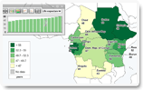
User interface
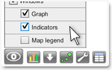
The StatPlanet user interface is organized into several panels as shown below. The StatTrends user interface is similar, but without the mapping components and indicator selection panel.
Many aspects of the user interface can be customized. For example, you can change the color scheme, show or hide specific interface panels on startup, and change the dimensions of the top three panels.

User interface components
- Graph Panel
- Indicators Panel
- Options Panel
- Map
- Selection Panel (select map areas in StatPlanet, or variables in StatTrends)
- Table Panel
- Time Slider
Thematic map
 |
Choropleth map Shade map areas according to the value represented by each area (for example, life expectancy). The map legend shows which map colors are associated with each data range (for example, higher values are typically shaded in increasingly dark colors). The map and map legend colors, ranges and values can be customized. Besides quantitative maps, qualitative or descriptive maps can also be displayed which convey non-numerical information. An example is this map of language distribution around the world. |
 |
Proportional symbol map
A proportional symbol map scales symbols (usually circles) according to the indicator being mapped. Each symbol can represent a country or other map area. In StatPlanet the symbol map is overlaid on top of the choropleth map (see above). This means that two data sets can be shown on the same map – one for the choropleth map and one for the symbol map. To show the symbol map, click the symbol icon (shown on the left) in the bottom-left corner of the screen. If you have bookmarked an indicator, the symbol map represents the data for the bookmarked indicator, whereas the choropleth map represents the data for the selected indicator. (If the bookmarked indicator is currently selected, both the symbol map and the choropleth map represent the bookmarked indicator). |
|
Select country or other map area using the map
|
|
Map legend
|
|
 |
Save / export map
You can find the save map button in the bottom-left corner of the screen. To change the image type, size or quality, use the Options Panel. This feature is only available in the web version. |
 |
Map navigation controls
The map navigation controls are normally hidden from view. Move the mouse towards the bottom-right of the screen to make them appear.
|

Graph Panel
The graph panel is displayed above the map in StatPlanet, and fills the screen in StatTrends. In StatPlanet, it can be maximized by the user to fill the screen, as well resized or hidden from view.
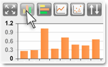
| Bar chart | |
 |
The bar chart and column chart buttons are located in the top left corner of the Graph Panel.
Use the "sort" button to sort the graph from lowest to highest, highest to lowest, highest to lowest starting in the middle, or alphabetically. |
| Time series (line graphs) | |
 |
The time series button is located in the top left corner of the Graph Panel. Use the Selection Panel to add countries, map areas or other variables (depending on your data set) to the time series graph. Click on it again if you wish to to remove it. Countries or other map areas can also be selected directly from the map (See also Selection Panel) Use the "sort" button to sort the time series labels. |
| Vertical bubble chart | |
 |
This button enables the display of country data as with the column chart, but with the values on the y-axis marked as bubbles rather than the top of a column. This display type has the advantage that it allows a second indicator to be visualized in the form of the bubble size. The bubble size follows the formula: value / maximum value.
|
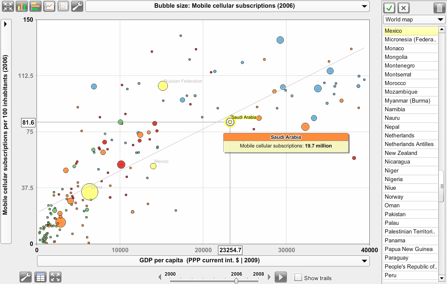
| Scatter Plot (bubble chart) | |
|
|
The scatter plot button is located in the top left corner of the Graph Panel. Clicking on the button will automatically use the selected indicator as the x-axis variable. You need to select a second indicator as the y-axis variable. Indicators can be selected either from the Indicators Panel, or in the Graph Panel (see below). Use the drop-down menu in the top of the Graph Panel to change the scale of the 'bubbles' according to a selected indicator. Use the 'options' icon in the Graph Panel to show or hide the trendline. Move the mouse over the trendline to see the slope and trendline equation. (See also the Wikipedia article Linear regression) Note: the x-axis and y-axis indicators are also shown in seperate panels to the left of the Graph Panel. The y-axis indicator is shown in Indicators panel, and the x-axis indicator in the Bookmarked panel right below. An add-on module is available for StatPlanet to display Pearson correlation coefficients in the scatter plot. |
 |
Select x-axis / y-axis indicator |
| Adjust graph size | |
 |
To change the graph size, move the mouse to the sides or corners of the Graph Panel until you see the cursor change to look like the one shown on the left. Click and hold down the left mouse button, then drag the panel to the size you want. Release the mouse button once you have the right size. |
| Search | |
 |
StatPlanet and StatTrends include a Search panel, selectable through the search icon in the Graphs panel. You can filter by indicator and category by typing into the search box. The list is updated dynamically as you type.
|
| Adjust graph scale The graph scale can be adjusted by clicking on the top or bottom graph values. The value can then be edited in the popup window. |


Indicators Panel
The indicators panel is displayed in the top-left corner in StatPlanet. It enables users to select an indicator through a scrollable list. Indicator values and horizontal bars visualizing the data values can optionally be added.


Selection Panel
Countries, map areas (or in StatTrends – any other defined variables) can be selected in various ways. An efficient way of finding and selecting a country or map area is through the Selection Panel, as explained below. However, a country or map area can also be selected by clicking on it in the map, in the Table Panel, or in the Graph Panel. In each case it will be highlighted in all of these StatPlanet components.
Click on a country/map area/variable in the list to select it. Clicking on a selected item will deselect it. You can press the first one or two letter of an item in the list to quickly jump to that item. For example, if it contains a list of countries, press 'b' to quickly jump to countries starting with the letter 'b'.
 |
If the Selection Panel is hidden, click the 'select' button in the bottom-left corner of the screen to make it appear. |
|
Select region |
 |
Select button Press the Select button to filter the list to your selection of map areas or items. This creates a custom-defined map region (in StatPlanet) or variable group (in StatTrends). |
|
|
Deselect All button |
 |
Refresh The Refresh button appears once you have created a custom region or group of items. It can be used to return to the original list. |
 |
Remove button To remove items from the list, select those you wish to remove and press the Remove button. |

Filters
-
A map region filter: A customizable map region filter allows you to focus on particular map regions or areas. For example, in the World Map edition, the default map filters are Central Asia, East Asia & Pacific, Europe, Latin America & Caribbean, Middle East & North Africa, North America, South Asia and Sub-Saharan Africa. You can set your own map regions, including the zoom coordinates so the map will zoom into your region when selected. Map filters can also be set by the user, through the Selection panel in the top-right corner of the interface.
- A time/date filter: The time/date (e.g. year) can be selected through a time slider below the map.
- A category and indicator filter: There is no fixed limit to this filter, as you can have any number of sub-categories, sub-sub-categories, etc. This gives you great flexibility in creating your own filters for your data, for example by topic or by population characteristics (sex, rural/urban, etc.).
- A search filter: StatPlanet includes a Search panel. By typing in a search box you can filter by indicator and category. The list is updated dynamically as you type. The search icon is found in the Graphs panel by default. It can also be placed in the Indicators panel.
Table Panel
The Table Panel is hidden from view by default. Tables are multidimensional and can be customized to display the data you are interested in.
 |
Table Panel Click the 'Table' button in the bottom-left corner of the screen to get a data table of the selected indicator. If an indicator has been bookmarked, the data for both the bookmarked and selected indicator will be displayed. The table also shows the mean, standard deviation and range. |
|
Save / Export table |
Time slider

Use the slider or click on the arrow buttons to change the year. Click on the play button to show changes over time as an animation, starting from the beginning. The animation speed can be set in the Options Panel (under the General tab). The 'play' button changes to a 'stop' button once the animation is running. You can press this button to stop the animation at any time.
Options Panel
The Options Panel is mainly for developers, and can be used to test out various settings and color schemes before making them permanent. However, it can also be activated for users who need fine-grained control over StatPlanet.
 |
Click the 'options' button in the bottom-left corner of the screen to open the Options Panel. |
|
Map:
Graph:
General options:
Save/export map: (web version only)
|
View menu
| Move the mouse over the 'View' button to see various options for showing or hiding StatPlanet map and graph elements and panels. | |
 |
|